The colours we use for design and branding can have a powerful impact on customer perception. Localizing colors for different cultures is key to creating a success global product.
Colors are an intrinsic part of any product or service. While they might seem like a minor detail, colors are way more vital than you think!
Have you ever thought that the colors of your product might affect your customers’ choices?
Indeed, colors have a considerable impact on customers’ buying behavior. This means that you have to be very careful when designing any aspect of your business, such as logo, website, communications, and packaging.
What’s more, colors have different cultural meanings. This, in turn, means that you have to carefully choose your product’s color scheme so that it does not clash with the cultural system of your international audience.
In this blog, you will learn more about colors, why they matter, and how to prepare your product for a more efficient localization process.
1. Why does Localizing Colors for Different Cultures matter?
If you want to catch your customer’s eye, you will rely on an attractive design in most cases. When it comes to design, colors are essential to making your product look more aesthetically pleasing.
Indeed, studies have shown that a product’s color has a significant influence on the customers. When customers see a product for the first time, they need less than 90 seconds to make a judgement.
In addition, color is the first feature of your brand’s logo that a customer will notice. Even more critical is that colors can increase customers’ positive response to a brand by up to 80%.
In other words, a client is up to 80% more likely to buy your product or service if your brand’s palette appeals to them.
What’s more, colors are an excellent tool for building a brand since they can add extra meaning to your product.

For instance, have a look at Kia’s new logo. It’s a simple design – black text on white background. You might think it’s not very catchy, but keep in mind that bright colors do not equal attention.
Firstly, this simple design enables easier localization. Indeed, regarding Kia’s logo, there won’t be any need to change the colors of its logo.
Secondly, dark colors are generally associated with luxurious brands. This, coupled with the simple design, transmits a sense of luxury, supremacy, and elegance.
Indeed, people are sensual beings, meaning that their visual senses play a huge part in determining their thoughts and behavior. A neatly presented product or service might catch a customer’s eye while mindlessly scrolling through Instagram.
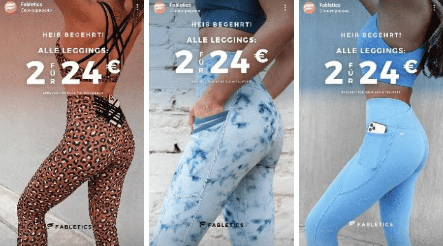
As a result, this opens new doors for any business. If you look at any commercial on social media, you will see how colorful they are. For example, have a look at a commercial of a sportswear brand on Instagram:

What catches the eye are the colorful leggings which pop up on the grey background. The customer does not see the logo. Nevertheless, they get attracted by the bright colors of the product. Thus, they are very likely to make a purchase.
Last but not least, color improves brand recognition by up to 80%. Take Tiffany & Co., for instance. Their brand color is blue; however, it is a particular shade that has even acquired its name from the brand – Tiffany blue.

And while one-third of all brands have blue color in their logo, everyone can recognize Tiffany blue. Tiffany & Co. is an excellent example of how colors can become one of the most recognizable features of a brand.
Overall, it is essential to understand that you have to select the colors of your brand carefully. Having a colorful logo is not always the correct answer. You might as well focus on the design of your product.
Either way, you also have to keep in mind that colors have different cultural meanings!
2. Cultural meanings of colors
As we discussed above, colors have different meanings in different cultures. The same color might have contrasting associations in other locales. Thus, when building your product or your brand, you have to do proper research.
- Blue. In North America and Europe, the blue color symbolizes authority, peace, and security.
Blue color associate with luck and good health in the Balkans due to amulets shaped like the blue eye.
In Hinduism, blue is the color of the god Krishna and thus, implies love and joy. Generally, blue is the color of brands such as Visa, Facebook, Ford and is believed to evoke a sense of trust, calmness, security. - Red. In Russia and most communistic republics, red associate with communism or the Soviet Union.
In Asian cultures, red is the color of prosperity, while it is often associated with blood and death in Africa.
Today companies like Red Bull and Coca Cola are associated with this color. Studies show red implies action, power, intensity, emotion. - Green. In Islam, green is the color of wealth and fertility.
Mexico and South Africa represent freedom and independence. In Western countries, green is the color of nature and growth.
Thus, nowadays, green coupled with brown and beige is part of the design of several sustainable brands, underlining their connection to nature.

- Yellow. In Western countries, this is the color of happiness, optimism, and joy; however, it is associated with envy and cowardice in Germany.
In Egypt, it is also considered the color of good fortune. This positive connotation is undoubtedly why brands such as McDonald’s and IKEA have used yellow in their logo.

As you can see, the very same color has different interpretations. Hence, it would help if you always kept in mind the cultural implications of a specific nuance since it can affect your success.
3. How to choose your brand’s color localization strategy?
When you decide to expand your business to new markets, you have two options:
- adapting your product’s colors to each new locale;
- choosing colors that will be associated with your brand regardless of the region
For instance, Coca-Cola is a brand that has established itself on the global market. Its red logo is well known everywhere. Even in Russia, where the red has a negative connotation instead due to the communistic past of the state, the brand has kept its symbolic colors.

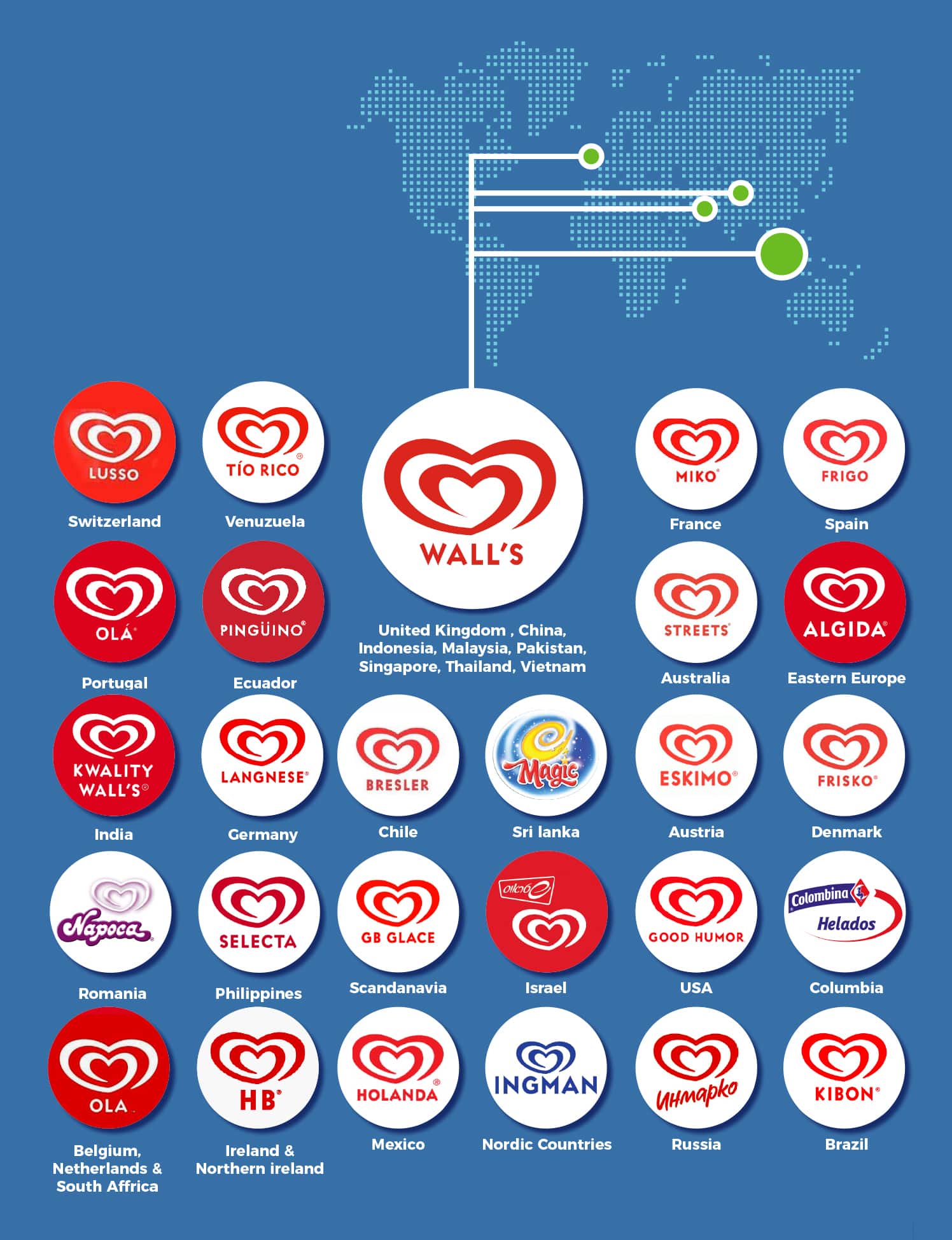
Algida, the ice cream brand, takes up the first approach. It adapts its brands’ colors to the different locales. It switches between red, orange, and blue, depending on the country:

However, it would help if you kept in mind that the logo itself is straightforward. This enables a more efficient localization process since there are not many elements that need to be adapted.
If you opt for the second approach, make sure that you carefully research which colors are well-accepted in your target locale. What’s more, while keeping the colors of your logo the same, you can still play with the design.
Have a look at IKEA’s website:
Image 1:

Image 2:

The first picture is from the Austrian/ German website of the company. As you have read, in this region, yellow has a rather negative connotation. Thus, it is absent from the design, although the company has kept its logo the same.
Also Read: Things to Consider When Localizing for the German Market
As you can see in the second picture, in Bulgaria, yellow is considered the color of happiness. Indeed, the text in the yellow box says that the company offers free delivery. This is a good enough reason to make your client happy!
You have to keep in mind that choosing the colors for your logo is not enough. To establish your brand, you need a website; you might even have stores, packaging your products, different kinds of content (e.g., videos and graphs, manuals).
All of these aspects should be taken into consideration when you work on your color palette. This, in turn, means that when you decide to expand to new markets, you have to adapt the colors schemes of your stores, packaging, website content, etc. In this way, you can ensure that your brand’s palette will appeal to the color preferences of your target customers.
Going back to the IKEA example above, you can see how the company has opted for a design with less yellow color in Germany and Austria. On the other hand, the images on the website feature pastel colors, which customers generally like.
Overall, when deciding on colors, it is imperative to consider all aspects of your brand. Besides your logo and the products or services you are offering, you have to maintain the overall brand image, including website and store design, video or graphic content, etc.
4. How to approach color localization?
Localization is the process of adapting content to new cultures. It goes beyond text and takes into consideration aspects such as colors, for instance. When you want to adjust your logo or your whole brand to a new locale, you have to consider the age and sex of your target audience.
Also Read: Localization VS Globalization VS Internationalization VS Translation
For instance, young people are more likely to experiment with bright colors than older people. There are specific gender-related preferences when it comes to colors which you should keep in mind:

Generally, when building your brand’s color scheme, you have to do it with localization in mind. Here are some tips for a better localization strategy:
- Customer representation. Your colors have to represent your customers and their preferences.
- Testing. Don’t follow blindly what is said about color associations – test several colors and make your own decision.
- Psychological studies. When choosing your colors, read psychological studies on the matter to create a better understanding.
- Color overload. Do not use too many colors. Color overload is likely to distract and confuse your customers, so keep it simple.
- Negative spaces. Negative space is your best friend – leaving more space between the different elements makes your design more user-friendly and aesthetically pleasing.
Also Read: Reduce Localization Costs: 6 Simple Tried and Tested Ways
In conclusion
Colors are an inextricable part of your product. You have to choose how to represent your brand visually carefully.
Several studies have shown that colors evoke different associations in people’s minds. This, in turn, can affect your clients’ buying behavior. Therefore, when localizing your brand for new markets, colors are a central aspect you should consider.


